Working with dashboards
Adding visualizations to a dashboard
The following instructions will create bar and donut charts. Before following these instructions, make sure PosApp is loaded in the Samples workspace, deployed, and running.
From the top menu, select Dashboards > View All Dashboards, then click PosAppDash. The dashboard's main page appears.
At the top right, click Edit this page (the pencil icon).
At the left of the page, select the Pages tab, then click + to add a new page.
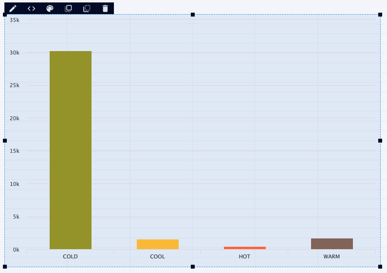
Select the visualizations tab, then drag the Bar visualization icon into the workspace and drop it. This creates a bar chart.
At the top of the chart, click Edit Query the (< > icon). The query editor opens.
In the Name field, enter
Samples.MyQuery. In the SELECT statement field, edit the query to readselect count(*) as Count, Category from MerchantActivity group by Category;(you can copy and paste from this document), being sure to end with a semicolon. This will select only the data needed for the chart: the count of WActions for each category and the category names. Click Save Query.To open the visualization editor, click Configure (the pencil icon) or double-click anywhere in the chart.
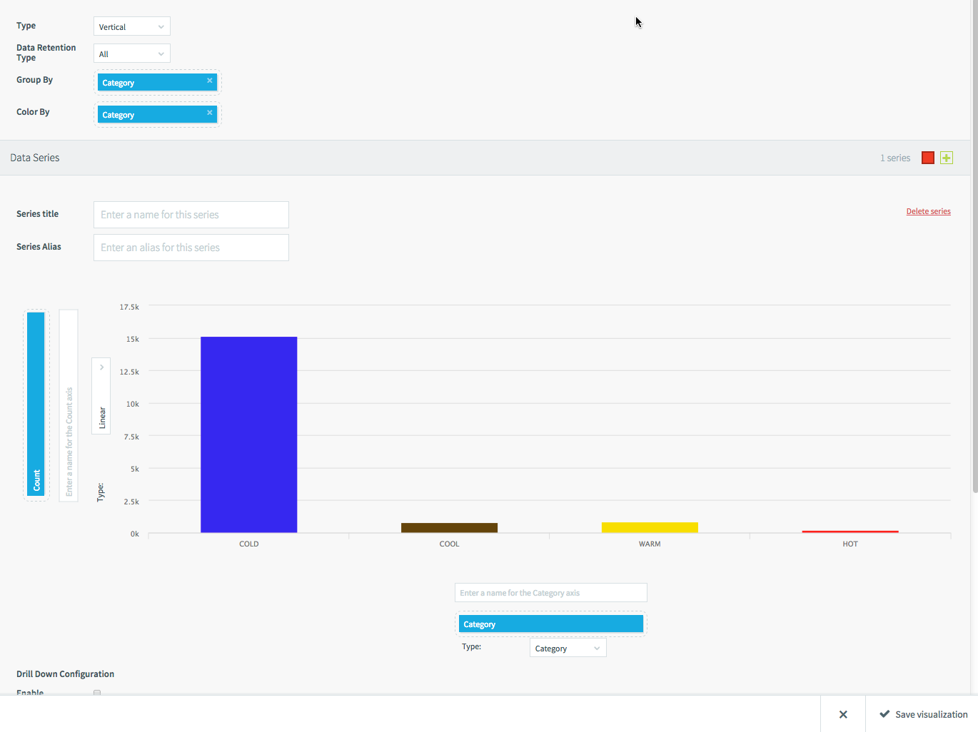
Set Group By and Color By to Category, the vertical axis to Count, the horizontal axis to Category, and the horizontal axis Type to Category, then click Save visualization. (The Category in the Type menu is a chart property, not the name of a field.) The chart appears in the workspace.
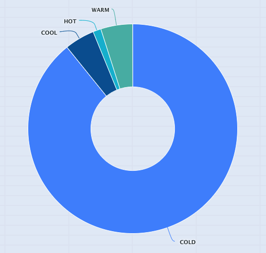
Drag the Donut visualization icon into the workspace and drop it to create a donut chart.
This chart will use the same query as the bar chart: click the Edit Query button, click in the Name field, select Samples.MyQuery, and click Save Query.
Click the Configure button, set the options as you did for the bar chart, and click Save visualization.
Defining dashboard queries
Once you have added a new visualization to a dashboard, the next step is defining its query. Until you do this, the drop-down field menus in the visualization editor will be empty.
For example, the query for the PosApp donut chart above is:
select count(*) as Count, Status from MerchantActivity group by Status;
This results in four Count values representing the number of merchants with each status. The Count values control the size of the slices and the Status values provide the labels.
Note
When you save a query, the previous version is overwritten, and there is no record of it within Striim. Thus, if you are making substantial changes, it is a good idea to give the query a new name so as to preserve the original, or to copy the original and paste it in a text editor.
Note
The dashboard page- and visualization-level filters (see Dashboards page) are available only when querying a WActionStore that is persisted to Elasticsearch (see CREATE WACTIONSTORE).
By default, dashboard queries are executed only once, when the visualization is loaded. To update the data, refresh the browser to reload the visualization.
To have the a query update continuously, enable polling in the visualization properties. (This property is hidden if the query contains AND PUSH). The query will then be re-run every five seconds, or, if the query takes longer, as soon as it completes.
When querying a WActionStore, the following additional syntax is available:
SELECT ... FROM <WActionStore>
[
{ <integer> { SECOND | MINUTE | HOUR } |
  JUMPING <integer> { SECOND | MINUTE | HOUR } |
  <integer> { SECOND | MINUTE | HOUR } AND PUSH }
] ...
[<time period>]withoutJUMPINGorAND PUSHreturns data for the specified period and does not update until you reload the page.[JUMPING <time period]immediately returns data for the specified time period and runs the query again at the same interval. For example,SELECT * FROM MerchantActivity [JUMPING 1 MINUTE]returns data for the past minute and then runs the query again every minute, so you always have one minute's worth of data that is never more than one minute old.[<time period> AND PUSH]returns data for the specified time period and adds more data every time an event is added to the WActionStore. For example,SELECT * FROM MerchantActivity [15 MINUTE AND PUSH]returns data for the past 15 minutes and adds new events indefinitely. Old data is not removed until you reload the page.Do not specify both
JUMPINGandAND PUSH.It is essential, particularly when using
AND PUSH, to include LIMIT and ORDER BY clauses in the query to avoid overloading the dashboard with more data than it can display.Any
WHERE,GROUP BY,HAVING,ORDER BY, orLIMITclause must follow the]. WhenPUSHis specified, polling is disabled.
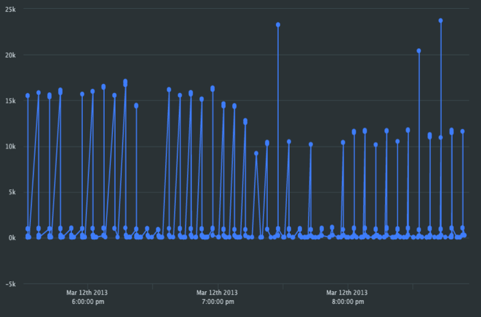
The SAMPLE BY clause (see CREATE CQ (query) may be useful when a visualization contains too many data points. For example, consider this chart using PosApp data with the query SELECT * FROM MerchantActivity ORDER BY time:
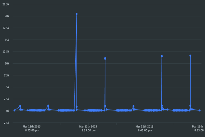
The dashboard shows as much of the data as it can hold, which is only the last half hour. If you change the query to SELECT * FROM MerchantActivity ORDER BY time SAMPLE BY count, the dashboard can show 3-1/2 hours of data:
Creating links between pages
To create a drill-down link similar to the one that leads from the Main page to the "Company details" page in PosAppDash:
If it does not exist already, create the target page (the page to be linked to).
Switch to the source page (the page with the link), select the visualization that will contain the drill-down link, and click Configure (the cog icon).
Under Drill Down Configuration, check Enabled.
From the Page drop-down, select the target page.
Under Page Filters, click Add Another.
In Source FIeld, select the field you want to use to select the data to be shown in the drill-down. For example, in PosApp, if you wanted to drill down from a map point for more information about a merchant, you would select MerchantId.
In Id, enter an alias to refer to the source field in the drill-down visualization's query. For example, for MerchantId, you might enter
mid.If you need more than one source field for the drill-down visualization's query, add additional page filters.
Save the visualization.
Return to the target page, create a query if it does not exist already, or click the existing query's cog icon.
Enter a SELECT statement using the Id(s) you defined in the source visualization and save the query. For example, to create a line chart of Count by StartTime and a table containing merchant details for the PosApp map drill-down described above, you might use this:
SELECT CompanyName, Count, StartTime, City, State, Zip FROM
Samples.MerchantActivity WHERE MerchantID=:mid ORDER BY StartTime;
Enter a SELECT statement using the Id(s) you defined in the source visualization and save the query. For example, to create a line chart of Count by StartTime and a table containing merchant details for the PosApp map drill-down described above, you might use this:
If one does not already exist, create a visualization in the query, then click Done.
Return to the source page and click whatever is associated with the drill-down. For example, for a line chart or map, click a point. The drill-down visualization should appear, populated with the data defined by the Source Field value for the point you clicked.
Making visualizations interactive
Drill-downs can be used within a single page to filter data interactively. For example, the PosApp visualization below can be filtered by clicking on the pie-chart labels:
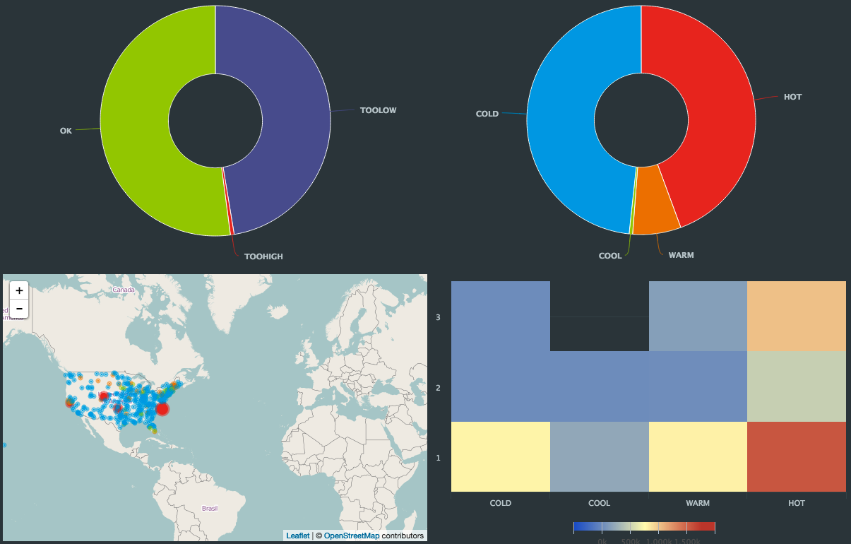 |
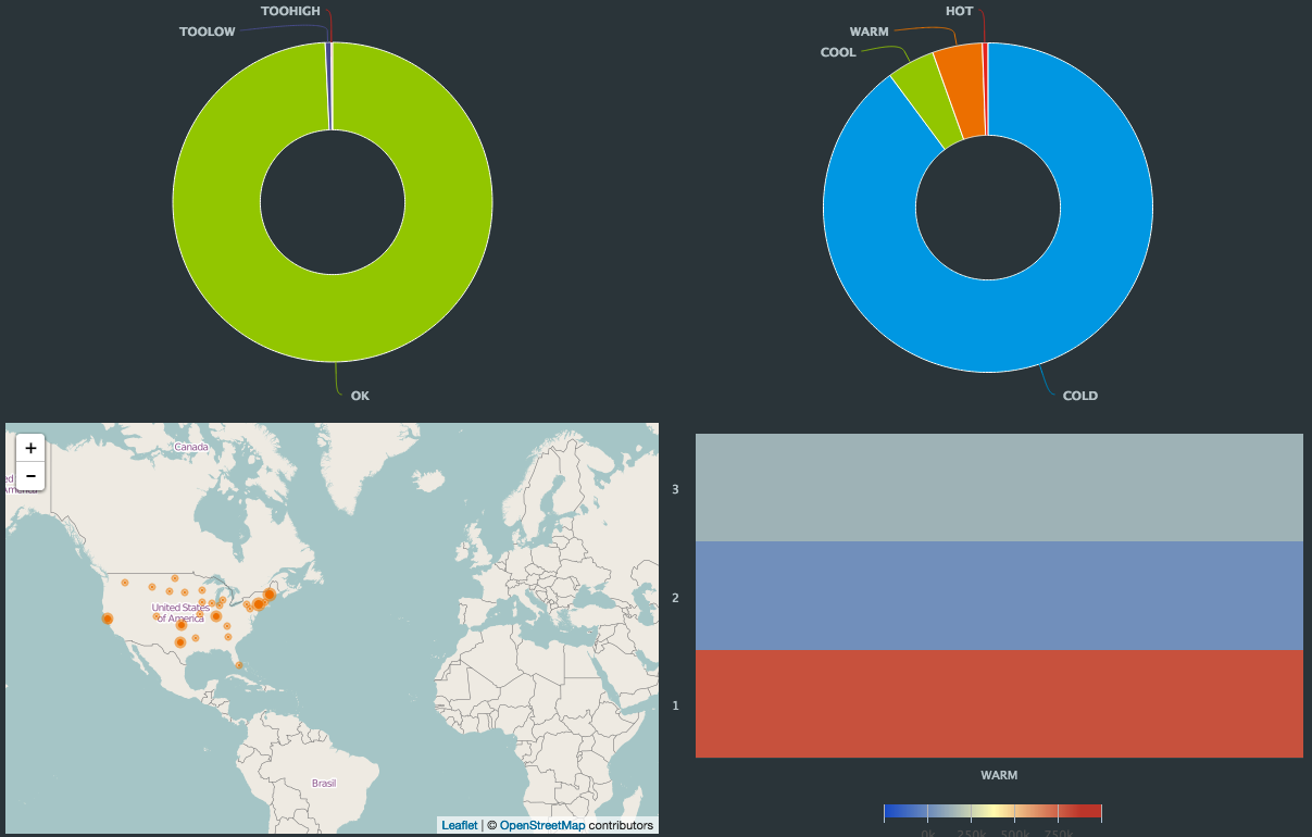
If you click the WARM label of the right-hand pie chart, the map and heat map display only data for merchants currently in that category:
 |
This interactivity is defined by setting the drill-down configuration in the pie charts, then using their Id values as in the queries for the two other visualizations. The drill-down configurations are:
visualization | drill-down configuration |
|---|---|
Status (left) pie chart | Page: Interactive HeatMap Id: status Source field: Status |
Category (right) pie chart | Page: Interactive HeatMap Id: category Source field: Category |
Since these visualizations are on the Interactive HeatMap page, the drill-down filters the data without switching to another page.
The US map's query is:
select * from Samples.MerchantActivity [15 minute and push] where (:status
IS NULL or (Status = :status)) and (:category IS NULL or (Category = :category))
group by merchantId;
When the page is first loaded, the :status and :category values are null, so the map displays all data. When you click the WARM label, the :category value is set to WARM, and the map updates accordingly.
To clear the filter and return to viewing all data, click Clear All (next to the funnel icon at left).
To explore this more, run PosApp and go to the Interactive HeatMap page.
Embedding a dashboard page in a web page
Use the Embed command to generate HTML code for an iframe you can use to display a Striim dashboard page in a web page. Embedded dashboard pages include both page-level and visualization-level search and search and filter controls.
The embedded dashboard will not require a Striim login. Instead, it uses a special user account with READ permission on the dashboard's namespace and SELECT permissions on the dashboard, its queries, and related the CQs, streams, and WActionStores.
Log in as admin or another user with the Global.admin role.
Go to the dashboard page you want to embed and click Embed.
The exact permissions that will be granted to the special user account are displayed. Click I Agree to create the user account.
Enter the desired width, height, and border width for the iframe, then click Copy.
Paste the iframe in the appropriate location in the web page's HTML.
Preview the web page (the Striim application must be running) and adjust the iframe's properties as necessary.